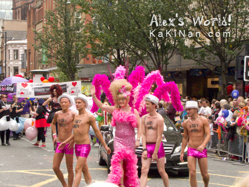
Last Saturday (24 August 2013), Manchester was greeted with Pride Day 2013. Pride parades, for the LGBT community, celebrate the lesbian, gay, bisexual and transgender (LGBT) culture in Manchester.
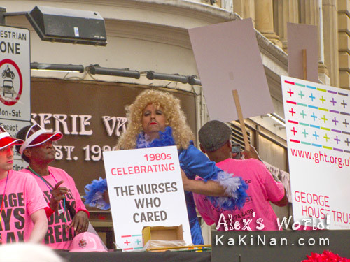
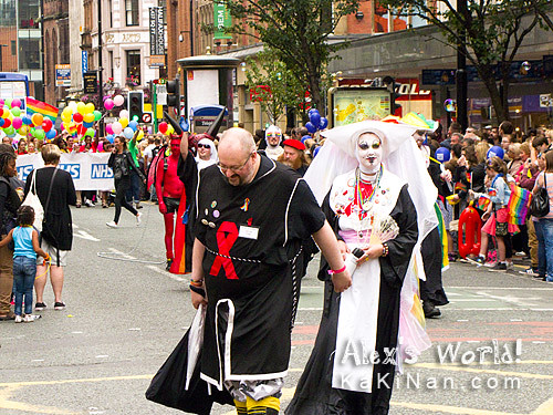
Interesting to see the variations of floats on parade that day. Below are more highlights of the parade.


Is that pirates I am seeing? Let us zoom in to have a closer look.

Oh, my! It is really a pirate ship. Quick, warn the rest about it!
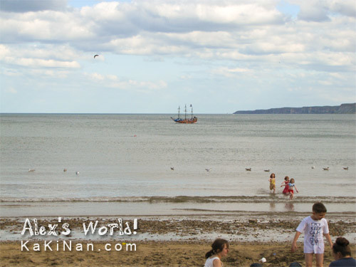
Pirates...! It seems like the pirates chose a day with good weather to invade. I like the white t-shirt the boy is wearing. It prints "Keep Calm and Call Out".
Oh no, the pirates have set foot on land!

I guess modern day pirates have different needs... 
"Public Conveniences"?
For more sky watching, enjoy the beautiful skies from all over the world at 

Can you decipher these signs on the notice board at Metrolink tram stations in Manchester?
To me these signs are very confusing and they can be interpreted in 2 ways:
- Both wheelchair users and prams should race to the boarding point?
- If the arrows in the signs represent the direction users of wheelchair and prams should head, then explain the next photo.
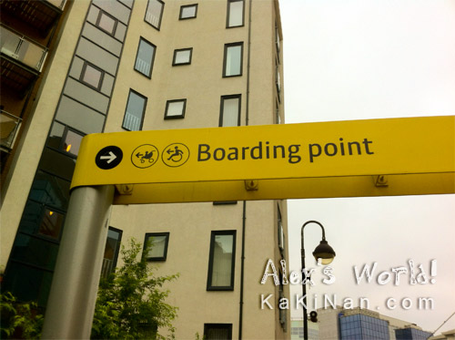
Either way, I'm confused. Err... prams and wheelchair users should get out of the trams so that others can board? Please don't read this the wrong way; I'm not against prams or wheelchair users. I'm just trying to interpret the signs here. I would like to hear what are your interpretations?
When we talk about Manchester, 2 things normally pop up: Football and rain... However, when it rains, everything starts to glitter.
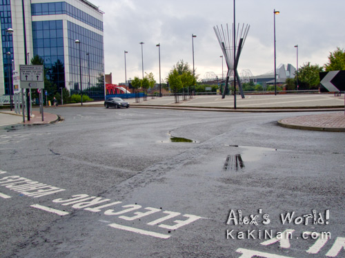
Not only do the glass windows from the buildings reflects the surrounding, now even pools of water on the ground reflects the surrounding. Worth noting is, if you are an electric vehicle owner, there are 2 charging bays at Exchange Quay (Postcode M5 3EB). This place is near to Old Trafford stadium, as you can see the roof of the stadium in the far end of the above photo.
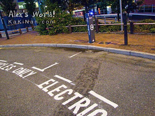
According to GMEV you can pay either by phone or using the GMEV access card.

For more sky watching, enjoy the beautiful skies from all over the world at 
For more beautiful reflections, please visit
Most of you must have read the incident about my SD card in my previous post. So I have decided to review another running application on my iPhone. Similarly to my other reviews, I will review the Runtastic Pro application over a 3Km run. The Runtastic application comes in 2 versions: a Runtastic Pro version and a Runtastic version. Basically the Runtastic Pro version cost GBP£2.99 in the UK, while the Runtastic version is free from the App Store. Worth noting that these apps are available in iOS, Android, Windows Phone and BlackBerry, but this review is done for the iOS version using an iPhone 4. Below is the screenshot of the map of my run from the Runtastic website.
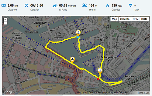
The app will take a few try to learn how to operate it. But once, you get a hang of it; it is actually quite easy to operate. I will rate the App 3.5 / 5 stars. This is because I felt the App is very commercialised. With the fee of GBP£2.99 I still need to pay for viewing my route online, otherwise it is a 30 days trail: Which is what I got. This was free in Map My Run app, which I previously reviewed. The elevation tracker is again incorrect like most apps. I guess this is because the apps uses the data provided by Google, which do not take into account of bridges (at least in and around Salford Quays).
The thing I like about this App is, your pace is actually shown on the map using colours. If you look close enough on the map, you will notice that the start and end points of the route I’ve taken are mapped in green and red dots respectively, while the route is mainly in yellow. Green symbolised excellent pace, then follow by yellow, orange and red. You will also notice that the phase before I reach Lowry Outlet Shopping Mall is in darker shade of yellow. This shows that I am running at a slower pace, basically because I have to climb up the bridge to cross the Quays. Not shown here is the elevation map. On all the Apps I have reviewed, this portion will normal be a trough. This is true if there wasn’t a water body there, but for my case it should rises because I was running on the bridge.
As I said, I think this is because these Apps uses data provided by Google and I guess the “experts” at Google have not came out with solutions to overcome this issue. An interesting issue for Google to investigate: Areas with bridges: should the elevation data be at the level of the bridge, water level or bed of the water body? Or even different levels of bridges that intersect? Maybe a separate data structure to encapsulate the different dimensions will be required? Or some form of measurement to overcome the ever changing landscape of cities and towns?
- 2024
- 2023
- 2022
- 2021
- 2020
- 2019
- 2018
- 2017
- 2016
- 2015
- 2014
- January 2014
- March 2014
- June 2014
- July 2014
- 2013
- February 2013
- April 2013
- May 2013
- July 2013
- August 2013
- September 2013
- October 2013
- November 2013
- December 2013
- 2012
- January 2012
- February 2012
- March 2012
- May 2012
- June 2012
- August 2012
- November 2012
- December 2012
- 2011
- February 2011
- March 2011
- May 2011
- July 2011
- August 2011
- September 2011
- November 2011
- 2010
- January 2010
- February 2010
- March 2010
- April 2010
- May 2010
- June 2010
- July 2010
- August 2010
- September 2010
- October 2010
- November 2010
- December 2010
- 2009
- March 2009
- April 2009
- May 2009
- June 2009
- July 2009
- August 2009
- September 2009
- October 2009
- November 2009
- December 2009


